Audrey Byker
2025
Brand Design
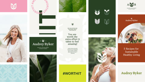
Audrey approached me seeking help with her outdated branding, clunky color palette, inconsistent logo use, visuals that didn't reflect her mission, and a lack of brand cohesion.
Through the discovery process, we explored different health and coaching brands. I knew Audrey's brand had to be something new and refreshed – and different from her competitors. What she offers is a unique, personalized, and tailored health journey that gets at the root of her clients' challenges. Her branding deserved to represent the high level and transformative work she does with her clients.
We knew a leaf was going to be the primary imagery. By designing a mark layered with her core values and deeper meaning, I took her brand from outdated to timeless, clunky to fresh, and inconsistent to unified. It now elevates her work so she can continue to grow and serve more and more people in West Michigan.


